Adding a Button-Toggle to a ControlBar
Description
You can add a Button-Toggle to a ControlBar. Toggle buttons can either be two-state (switching between a true and a false state), or multi-state (each click advances to the next button state). The video shows how the state of a Button-Toggle is used to control what action a button performs when clicked.
For a visual explanation on how the state of a Button-Toggle is used to control what action a button performs when clicked follow the guide below or watch this video:
Adding a Button-Toggle to a ControlBar
In this video we show how you can add a Button-Toggle to a ControlBar. Toggle buttons can either be two-state (switching between a true and a false state), or multi-state (each click advances to the next button state).
The video shows how the state of a Button-Toggle is used to control what action a button performs when clicked.
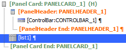
Create a Component with a ControlBar and List
In the UX Builder open the Properties page. In the UX Properties section click the
 button next to the 'Style name' property.
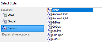
From the 'Location' menu select 'System' and from the style options select the 'Alpha' style. Click OK.
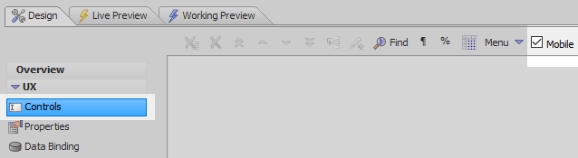
Open the UX Controls page and check the 'Mobile' checkbox.
Open the Panels menu and select the [Panel Card] option to add a panel card to the component tree.

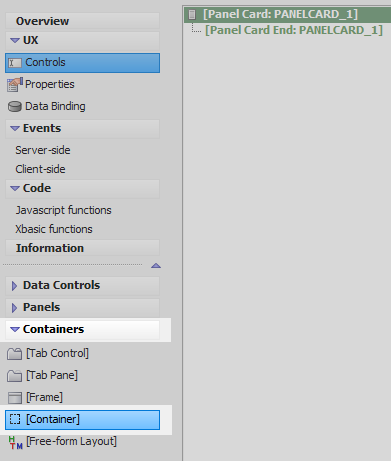
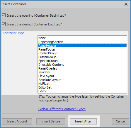
Highlight the panel card. Open the 'Containers' menu and click on the [Container] option.
From the Container Type list select 'PanelHeader' and click the 'Insert After' button.
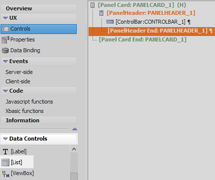
Highlight the panel header. Open the 'Other Controls' menu and select the [ControlBar] option to add a control-bar to the panel header.

Highlight [PanelHeader End: PANELHEADER_1]. Open the Data Controls menu and click [List] to add a list control underneath the panel header.
Highlight the list control. In the properties list on the right, under List Properties, click the
button next to the 'List properties' property to open the List Builder.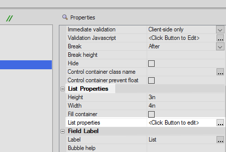
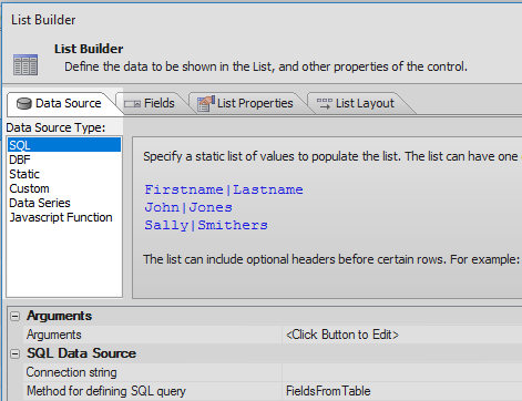
In the List Builder open the Data Source Pane. Set the 'Data Source Type' to SQL.
Click on the
button next to the Connection String property, in the SQL Data Source section.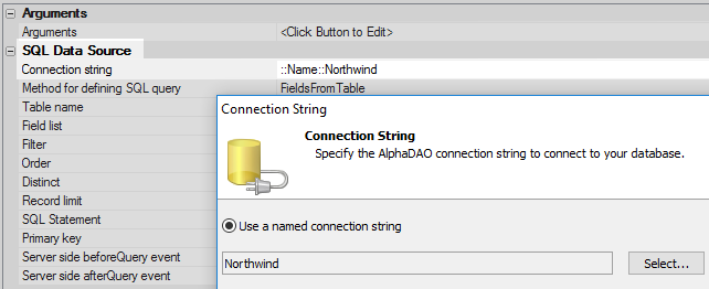
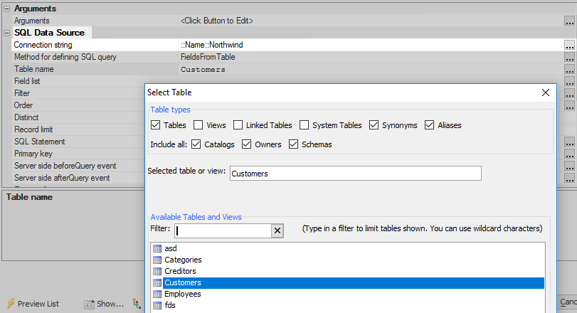
Set the 'Table name' property to the 'Customers table.
Click the
button next to the 'Field list' property and select the 'ContactName' and 'City fields'.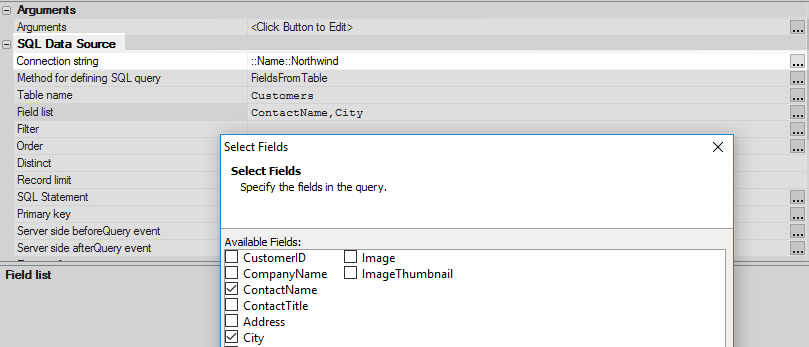
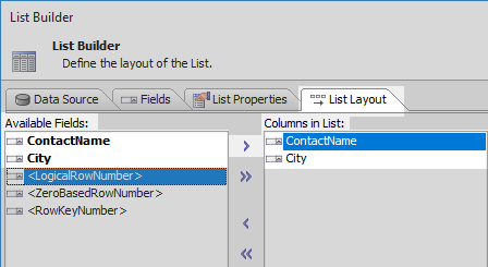
Open the List Layout pane. Use the blue > arrow to move the ContactName and City fields from the Available Fields list to the 'Columns in List' area. Click OK to close the list builder.
The component tree should now look like this:
Add a Button-Toggle that Navigates the List
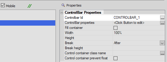
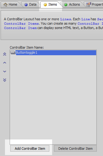
Highlight [ControlBar:CONTROLBAR_1]. In the Properties list under ControlBar Properties click the 'ControlBar properties' property to open the ControlBar Builder.
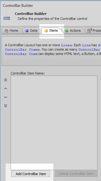
In the ControlBar Builder open the 'Items' pane and click the 'Add ControlBar Item' button.
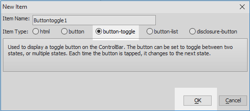
Select 'button-toggle' option from the Item Type choices and click OK.
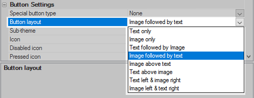
In the ControlBar Item Properties menu go to the 'Button Settings for Button-Toggle' section. Set the 'Button layout' property to 'Image only'.
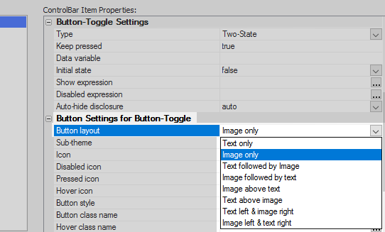
In the same section click the
button next to the 'Icon' property.
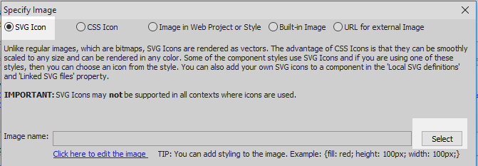
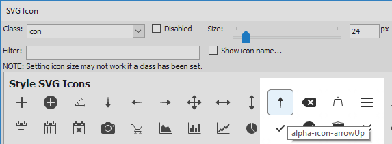
In the 'Specify Image' dialog select 'SVG Icon' from the list of radio button choices. Hit the 'Select' button.
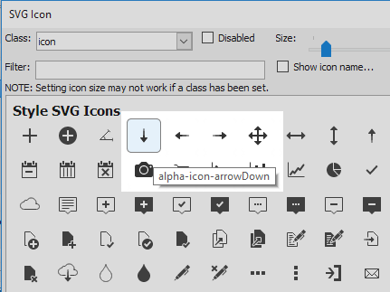
Click on the 'arrowDown' SVG icon to select it and click OK and OK again.
Back in the 'Items' pane click the
button next to the 'Pressed icon' property. This should be just below to Icon property.
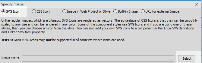
Choose the SVG Icon property and click 'Select'.
Click on the 'arrowUp' icon and click OK and OK again.
In the 'Items' pane scroll up the ControlBar Item Properties list to the 'Button-Toggle Settings'. Make sure the Type property is set to 'Two-State'.
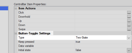
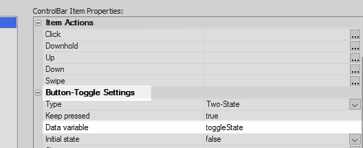
Next to the 'Data variable' property define a new data variable called 'toggleState'.
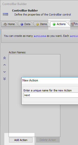
Open the 'Actions' pane and click on the 'Add Action' button to create a new action. Give the action the name 'next'.
Add the following Javascript to define the action:
var lObj = {dialog.object}.getControl('list1');
if(!this.data.toggleState) {
    lObj.navigate('next');
} else {
    lObj.navigate('prev');
}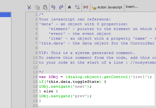
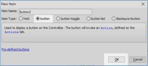
Open the 'Items' pane again. Click the 'Add ControlBar Item' button.
From the Item Type choices select 'button' and click OK.
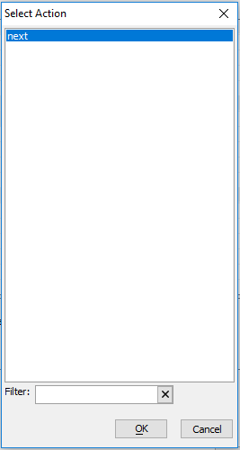
Highlight the button item. In the ControlBar Item Properties list, under 'Item Actions', hit the
button next to the 'Click' property.
Select the 'next' action that you just defined.
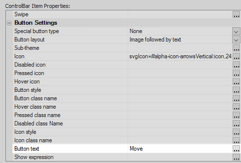
Scroll down the ControlBar Item Properties list to the Button Settings. Change the 'Button layout' property to be 'Image followed by text'.
Click the
button next to the Icon property.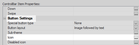
In the Specify Image dialog select the 'SVG Icon' option and click 'Select'.

Select the 'arrowsVertical' icon and click OK and OK again.

Towards the bottom of the Button Settings section set the 'Button text' property to read 'Move'.
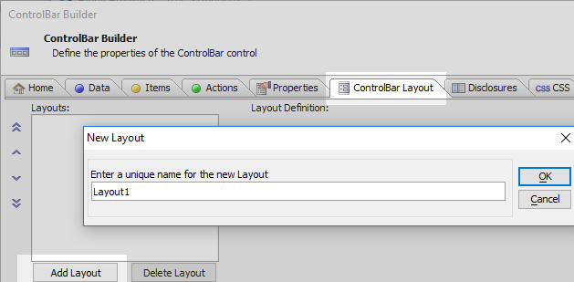
Open the ControlBar Layout pane. Click the 'Add Layout' button. Give the layout a name like Layout1 and click OK.
Click the 'Add Line' button
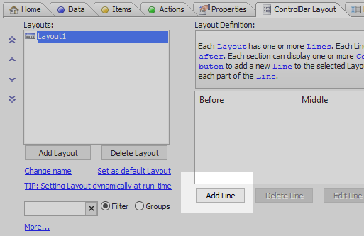
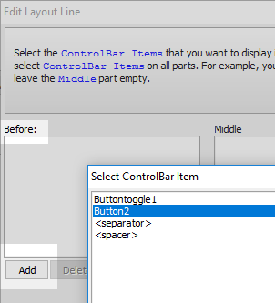
Click the 'Add' button under the Before section, highlight the button item you defined, and click OK.
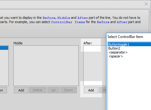
Add the 'button-toggle' item to the 'After:' section by clicking the 'Add' button, highlighting the 'button-toggle' item and clicking OK. Click OK to close the Edit Layout Line dialog.
Click OK again to close the ControlBar Builder. Run the component in Live Preview
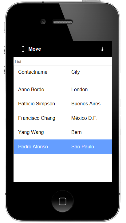
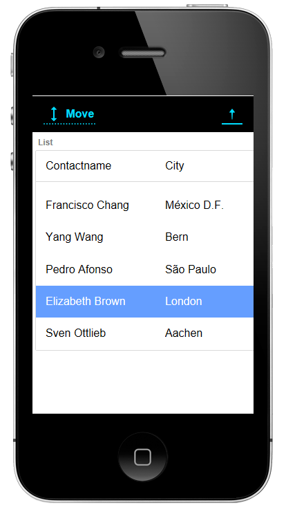
Click on a row in the list and press the 'Move' button. You should be able to move down the list control.
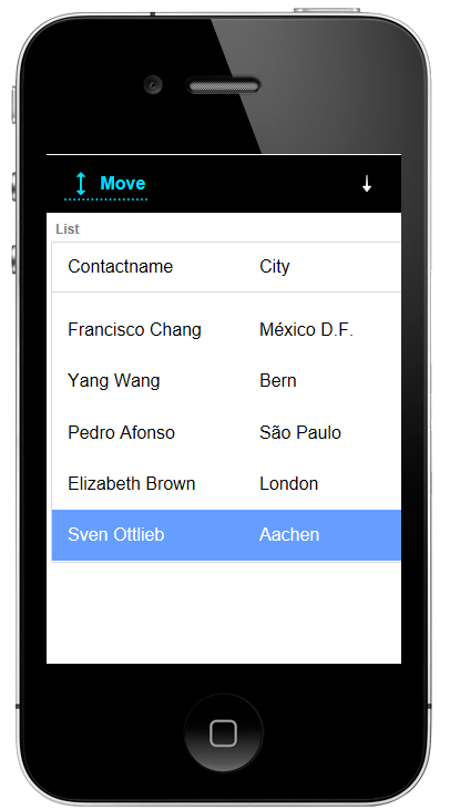
Now try pressing the button-toggle button. The icon should change to point up. Click on the Move button again and you should be able to move up through the rows in the list control.